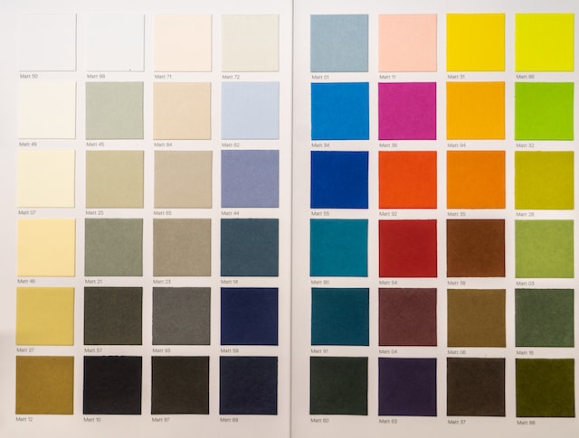
The Pantone Color Matching System (PMS) is an essential tool for designers, printers, and anyone who works with color. But where did it come from, and how has it evolved over time? In this article, we’ll take a look at the history and evolution of the Pantone Color Matching System.
The Origins of Pantone
The Pantone company was founded in 1962 by Lawrence Herbert, a chemist and colorist who wanted to standardize the language of color. Herbert believed that creating a standardized system for identifying and communicating colors would make it easier for designers, printers, and manufacturers to work with color.
Herbert’s initial idea was to create a system of color matching based on standardized ink formulations. He developed a set of ten basic colors and mixed them together in different proportions to create a range of secondary colors. This system was called the Pantone Matching System (PMS).
The Early Years of Pantone
In the early years, the Pantone system was primarily used in the printing industry. Printers could use the Pantone swatches to match the colors used in artwork and ensure that the colors were accurately reproduced in the final printed product.
However, the Pantone system quickly became popular in other industries, including fashion, interior design, and product design. By the 1970s, Pantone colors had become a standard reference for color in a variety of industries.
The Evolution of Pantone
Over the years, the Pantone system has evolved and expanded to meet the needs of designers and manufacturers. Here are some of the key milestones in the evolution of the Pantone Color Matching System:
1987: Introduction of the Pantone Hexachrome System
The Pantone Hexachrome System was introduced in 1987, providing a six-color printing process that allowed for more accurate and consistent reproduction of colors. This system used a set of six base inks (cyan, magenta, yellow, black, orange, and green) to create a wider range of colors.
1993: Introduction of the Pantone Plus Series
The Pantone Plus Series was introduced in 1993 and expanded the Pantone system to include over 1,000 new colors. This series included metallic and fluorescent colors, as well as pastels and neons.
2000: Introduction of the Pantone Goe System
The Pantone Goe System was introduced in 2000 and was designed to be more user-friendly than previous Pantone systems. This system included over 2,000 colors and was organized into easy-to-use color families.
2010: Introduction of the Pantone Fashion, Home + Interiors System
The Pantone Fashion, Home + Interiors System was introduced in 2010 and was designed specifically for the fashion, home, and interior design industries. This system included over 2,000 colors and was organized into color families that were inspired by nature.
2016: Introduction of the Pantone Color of the Year
In 2016, Pantone introduced the Color of the Year program. Each year, Pantone Australia selects a color that represents current trends and attitudes in society. This color is used in a variety of industries, including fashion, interior design, and graphic design.
Conclusion
In conclusion, the Pantone Color Matching System has come a long way since its inception in 1962. What started as a simple system for matching ink colors has evolved into a comprehensive system for identifying, communicating, and reproducing colors across a variety of industries.
The Pantone system has revolutionized the way designers, printers, and manufacturers work with color, providing a standardized language for color that is recognized and respected around the world. As the design industry continues to evolve, it is clear that the Pantone Color Matching System will continue to play a critical role in the creation of visually appealing and effective designs.


